


Church of Scotland – Illustration
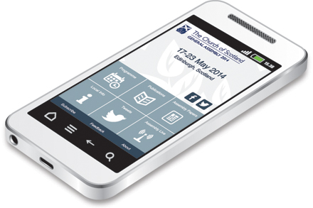
An image of a non-branded smartphone was required for use on a range of materials, to promote an app for the Church of Scotland Assembly. As the image would be used on a pop-up banner, it was drawn in Illustrator so it would be resolution-independent and suitable for production at a large size.
Bruichladdich Distillery – Shop Merchandise
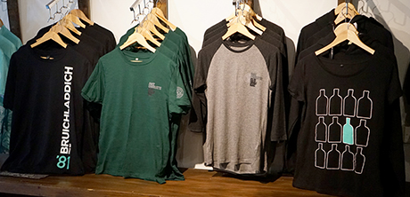
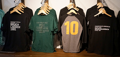
A range of clothing, accessories and product packaging for sale in the distillery shop and online.

Scottish Government – ‘Scotland’s Future’ White Paper
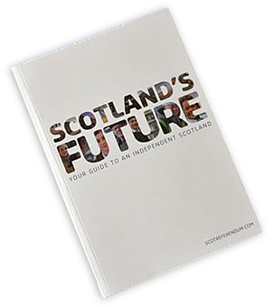
Work on the Scottish Government’s blueprint for an independent Scotland. Kaz provided the initial artworking demonstration to the client at planning stage and set up the master templates for the
668-page document, as well as being a member of the artworking production team. The project was undertaken with extremely tight security to prevent any leaks of the content before publication.
1

Staples – Point-of-Sale and Advertising
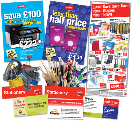
Union Direct completed an initial point-of-sale campaign for Staples. The client was impressed with the standard of work and Union gained all the point-of-sale for Staples over several seasons and the contract for national press advertising.
1

Scottish Government – Scotland’s Marine Atlas eBook
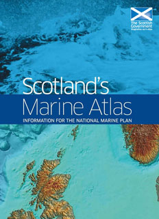
This eBook adaptation of Scotland’s Marine Atlas was created in Wordpress. Complex maps, charts and images with annotations were lifted from the original artwork and carefully resized to strike a balance between legibility and excessive file size. The eBook achieved a Gold Award at the Chartered Institute of Public Relations PRide Awards Scotland, and beat over 200 other entrants to win Flowable eBook of the Year 2014 at the Digital Book Awards in New York.
View online at scotgov.publishingthefuture.info/publication/marine-atlas
Xerox – Pan-European Catalogues and Newsletters
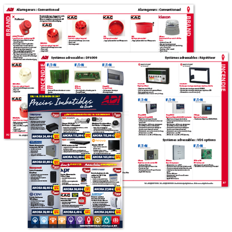
Extensive project for Xerox’s client – sales newsletters and product catalogues for all European territories in multiple languages.
Built using the ‘Step’ data management plugin for InDesign.

Dobbies Garden Centres – Literature and POS
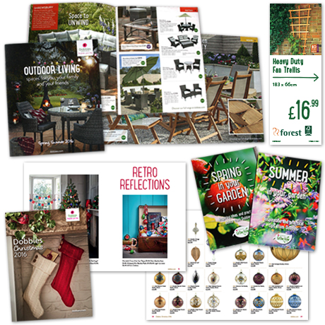
In-house designer and artworker at Dobbies Garden Centres’ Head Office studio in Edinburgh, creating point-of-sale for all 34 stores across the UK. Work also included catalogues, lifestyle-focused garden products brochures and gardening tips leaflets. Additional duties included deputising for the Production Manager in his absence.

Morrisons – Internal Communications
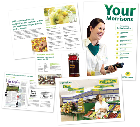
Range of internal comms publications for The Workshop’s client Morrisons, including staff newsletters, awards entries, presentations and product information boards.

VisitScotland – Regional Guides
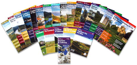
Production of the VisitScotland Where to Stay, What to See & Do,
Golf and Gardens Guides in 2012, 2013, 2014 and 2016 – the flagship range of guides for the Scottish tourist board, comprising over
30 brochures. The guides consisted of an editorial section followed by advertising pages for local accommodation and activities: the largest guide numbered 172 pages and contained over 900 adverts.
In 2013, the guides were produced by a team of ten artworkers, which Kaz managed. In 2014, the advertisement production was automated, with Kaz involved in the initial specification of the database, inputting data, assisting with client amends and managing approval and final output of the advertising. Kaz and one other creative artworker also designed and artworked all the editorial sections.
Kaz was responsible for liaison with the client at VisitScotland and managing the production, checking and supply of proofs and delivery
of the final artwork to the printers to the required timescale.
During 2013 and 2014, Kaz was responsible for the maintenance of the brand guidelines for the regional guides. In May 2014, she was also involved in developing guidelines to provide standardisation and consistency across all VisitScotland publications.

Royal London Group – Rebrand
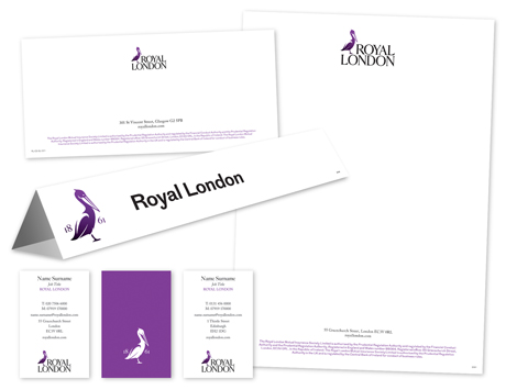
In 2014 the various divisions of Royal London Group rebranded to a uniform design across the company. APS Group, as the artwork studio for Scottish Life, Bright Grey and Scottish Provident, implemented the new brand guidelines across a large range of stationery and literature. Kaz was the lead artworker on the RLG account from 2010 to 2014.
Bruichladdich Distillery – Packaging
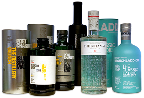
In-house artworker and designer for Bruichladdich Distillery, creating all packaging – tins, labels, shipping cases, capsules and neck tags. Ensuring mandatory and legal compliance for markets across the globe. Ensuring adherence to brand guidelines. Liaising with stakeholders throughout the company, across the wider Rémy Cointreau network and with external suppliers. Designing merchandise for the distillery shop and website. Creating marketing materials – adverts, posters, event graphics, press releases, presentations. Product, staff and location photography.
learndirect – Infographics
A range of icons to represent courses offered by learndirect –
over 150 different icons designed for The Workshop, many with multiple variants.
Dobbies and Bruichladdich – Photography
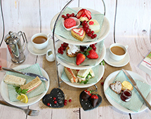

Photography work for Dobbies Garden Centres included product shots for use in brochures and on point-of-sale, and lifestyle shots to promote events in stores and restaurants. For Bruichladdich Distillery, work included staff portraits, product shots, landscapes of Islay and technical images of the distillery buildings for reference purposes.

Various Clients – Packaging

Wide-ranging packaging experience, including everything from lawnmower boxes to FMCG for Marks and Spencer beauty products, haircare ranges, computer games, products for Staples, tin and corrugate packaging for Bruichladdich Distillery and various Travis Perkins brands such as Wickes and Tradeline.
Johnston Oils – Retouching
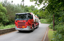



The client had some good photography of their oil tankers, which had, however, been shot in summer against a leafy background. They wanted to use the images in a campaign to boost heating fuel sales during the winter. A stock shot of a winter road was purchased and the tanker was grafted in, with relevant colour balancing to remove the warm green reflections of the summer trees. The image was also flipped to work more favourably with text on advertising and flyer applications, necessitating extensive retouching of branding and signage on the tanker.
A blue version was also produced when the client was considering the use of different liveries on their tankers.
The client was very pleased with the outcome, which became known as the ‘Narnia’ image and was used extensively across printed literature and website applications.
